Gata Jewellery, based in the vibrant heart of Ibiza, embodies the island’s wild, sun-soaked spirit through its exquisite high-quality pieces. The brand fuses artisanal craftsmanship with a modern digital experience, creating jewellery that is both deeply personal and unmistakably contemporary. Every design captures the free-spirited elegance of Ibiza—its creativity, its imperfections, and its soul.
Gata Jewellery isn’t just about adornment; it’s about a lifestyle rooted in authenticity and emotional connection. Known for its impeccable quality and organic design philosophy, the brand quickly became a symbol of effortless sophistication for a global audience seeking something real.
The Challenge
As Gata Jewellery expanded internationally, the brand needed a consistent identity and a digital experience that resonated with its clientele. The challenge was twofold: establish a visual language that translated the island’s character into a cohesive luxury brand, and create a digital platform that mirrored the intimacy and warmth of the in-person boutique experience.
Branding
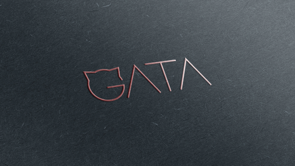
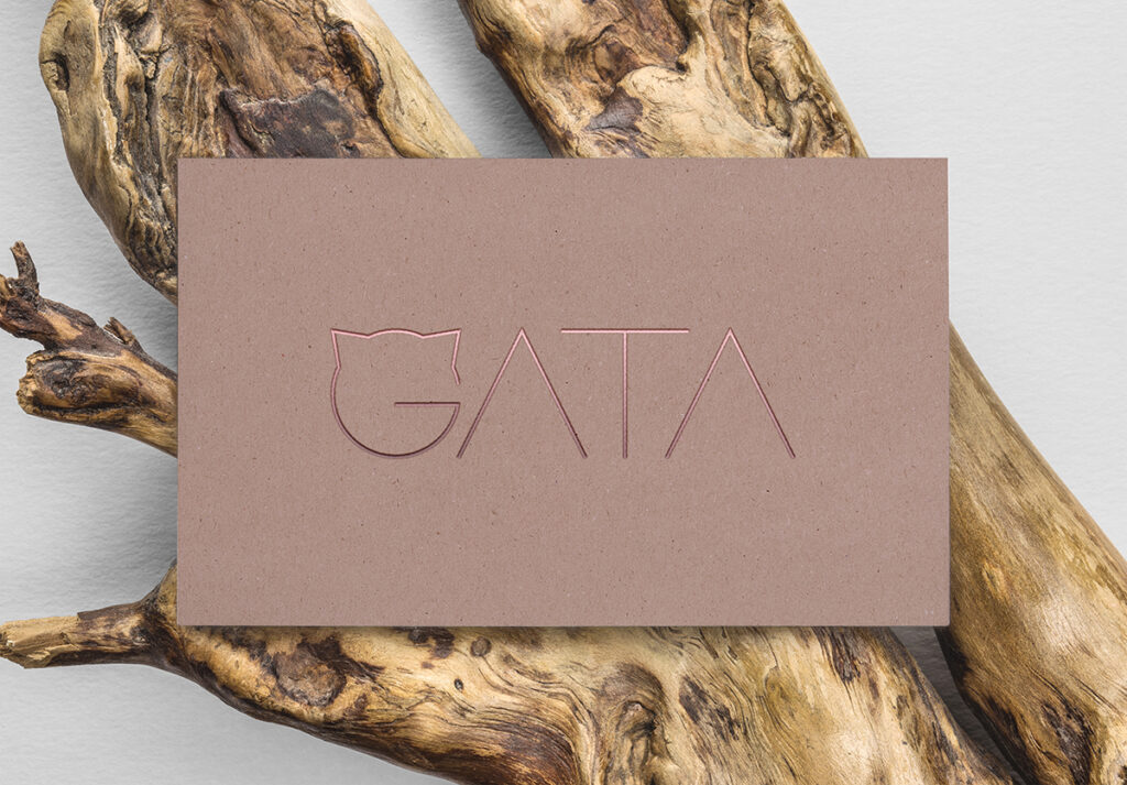
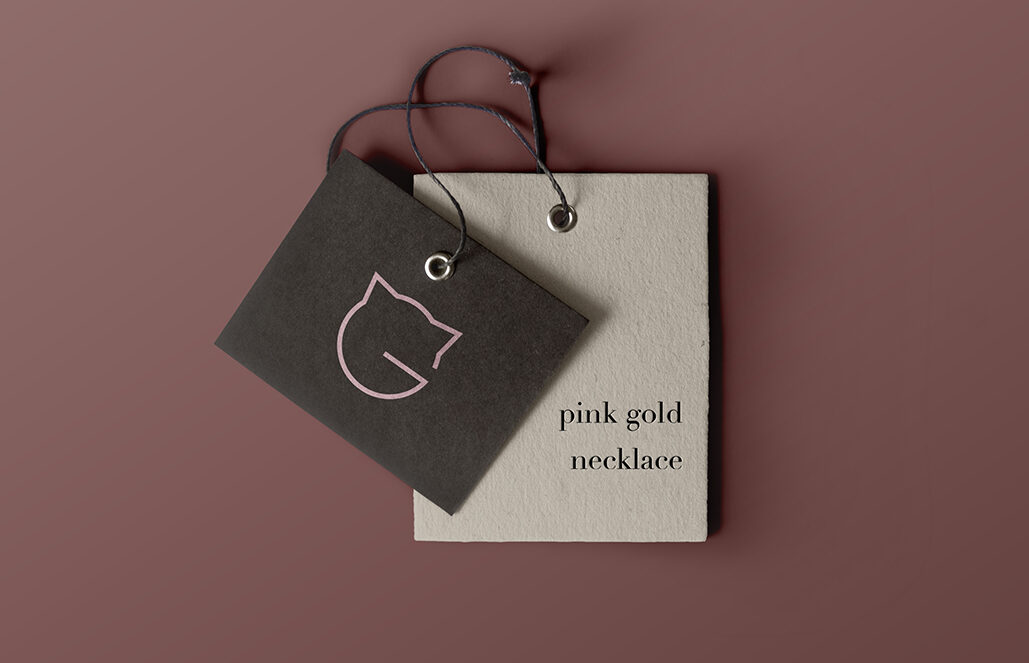
We began by exploring the essence of the island — not the glossy tourism version, but the Ibiza known by locals: wild cliffs, handmade markets, sun-bleached textures, and a quiet sense of spirituality. The logo evolved from organic sketches mimicking the movement of sand and waves, refined into a geometric mark resembling a hand-carved seal.
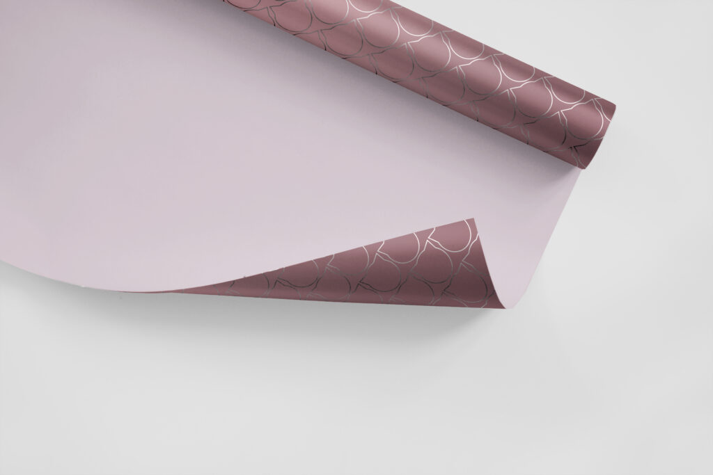
The brand palette reflected the island’s contrasts: oxidized gold and rose like sunset and artisanal touch, and deep teal inspired by the Mediterranean at dusk. Typography followed suit — tactile, elegant, but with imperfect edges that gave it warmth and humanity.
Creative Direction
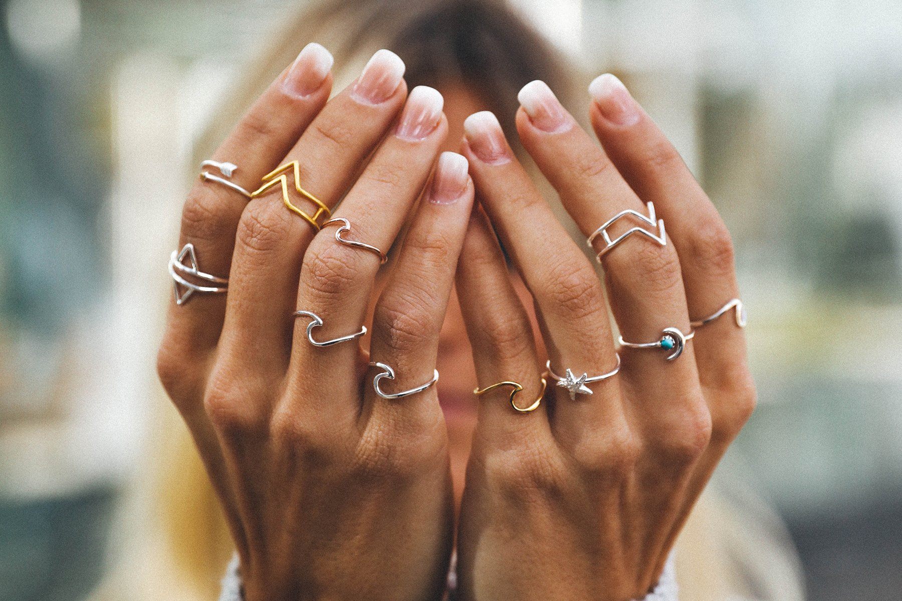
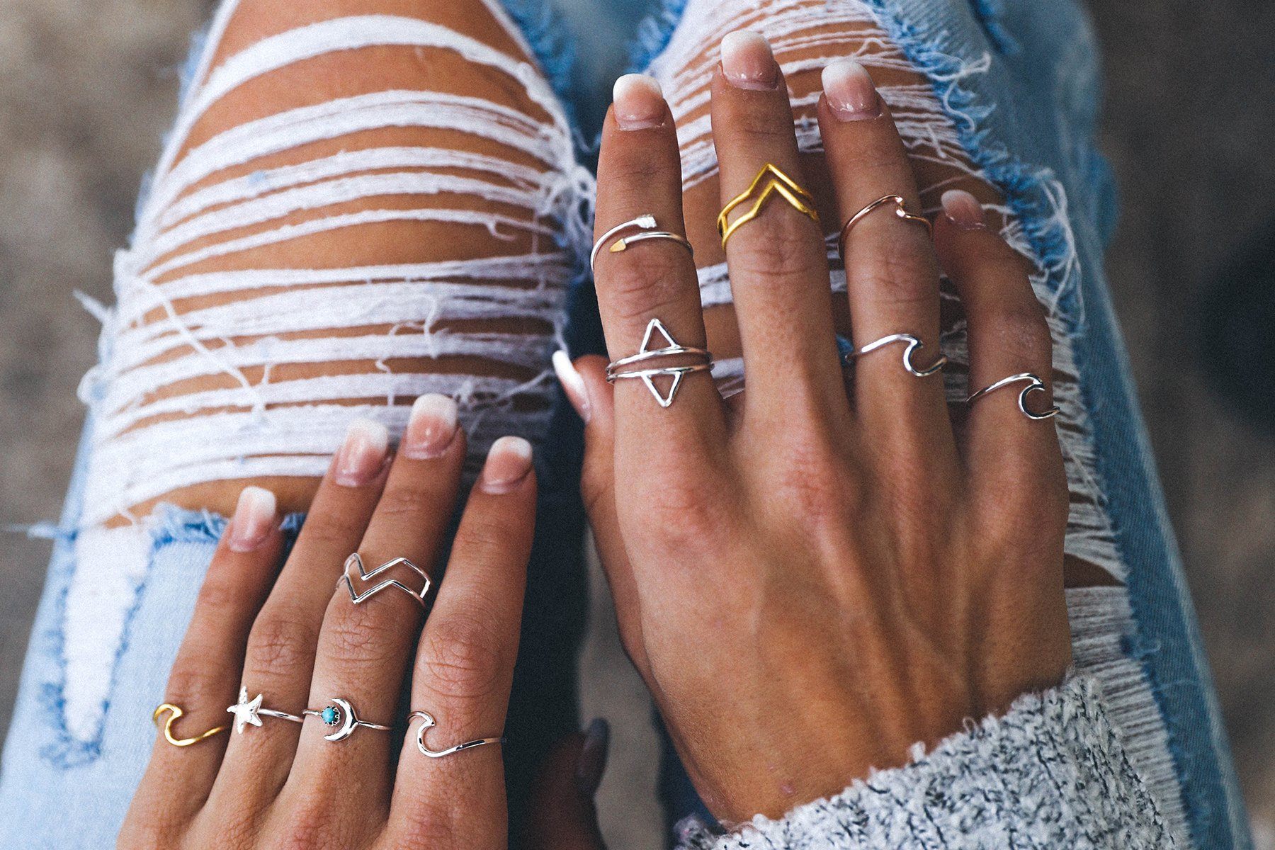
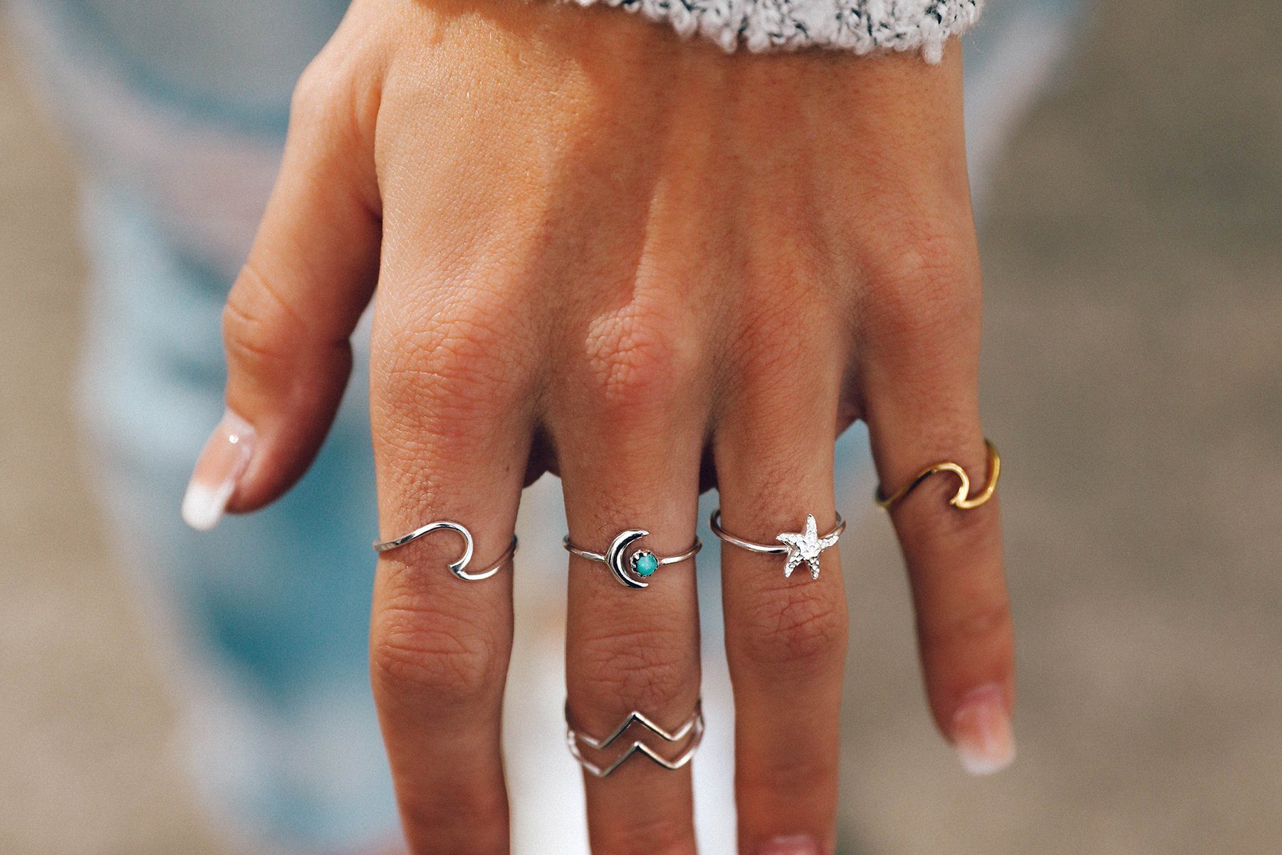
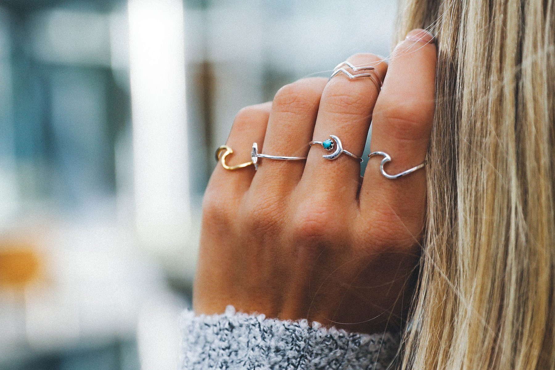
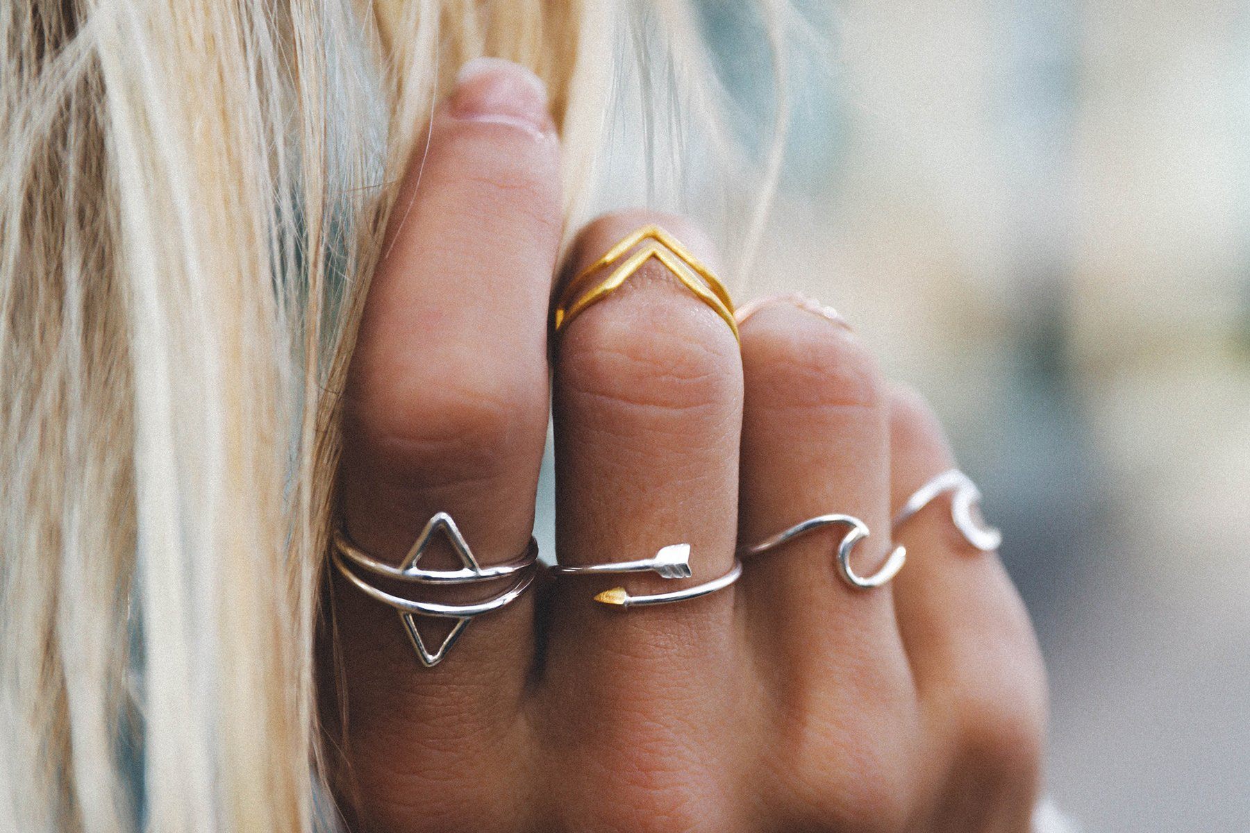
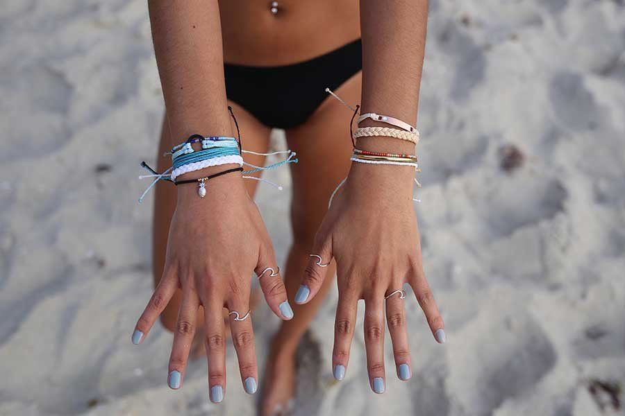
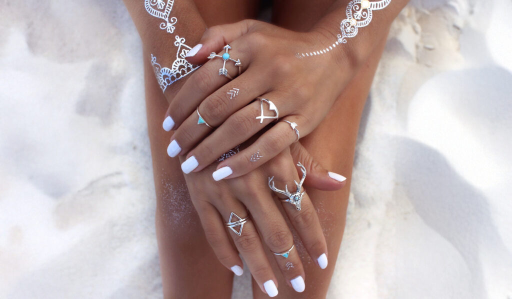
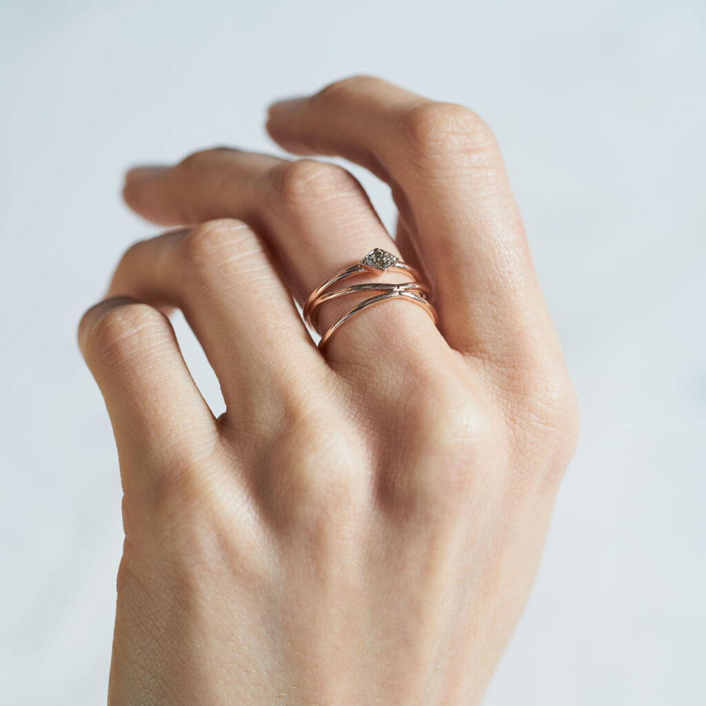
For the photoshoot, we captured the jewellery in its natural habitat — sunlight filtering through linen curtains, reflections on salt-crusted windows, and the slow rhythm of island life. The art direction emphasized authenticity: models were not posed but inhabited their moments. The visual tone drew from 1970s analog photography, evoking nostalgia and sensual imperfection.
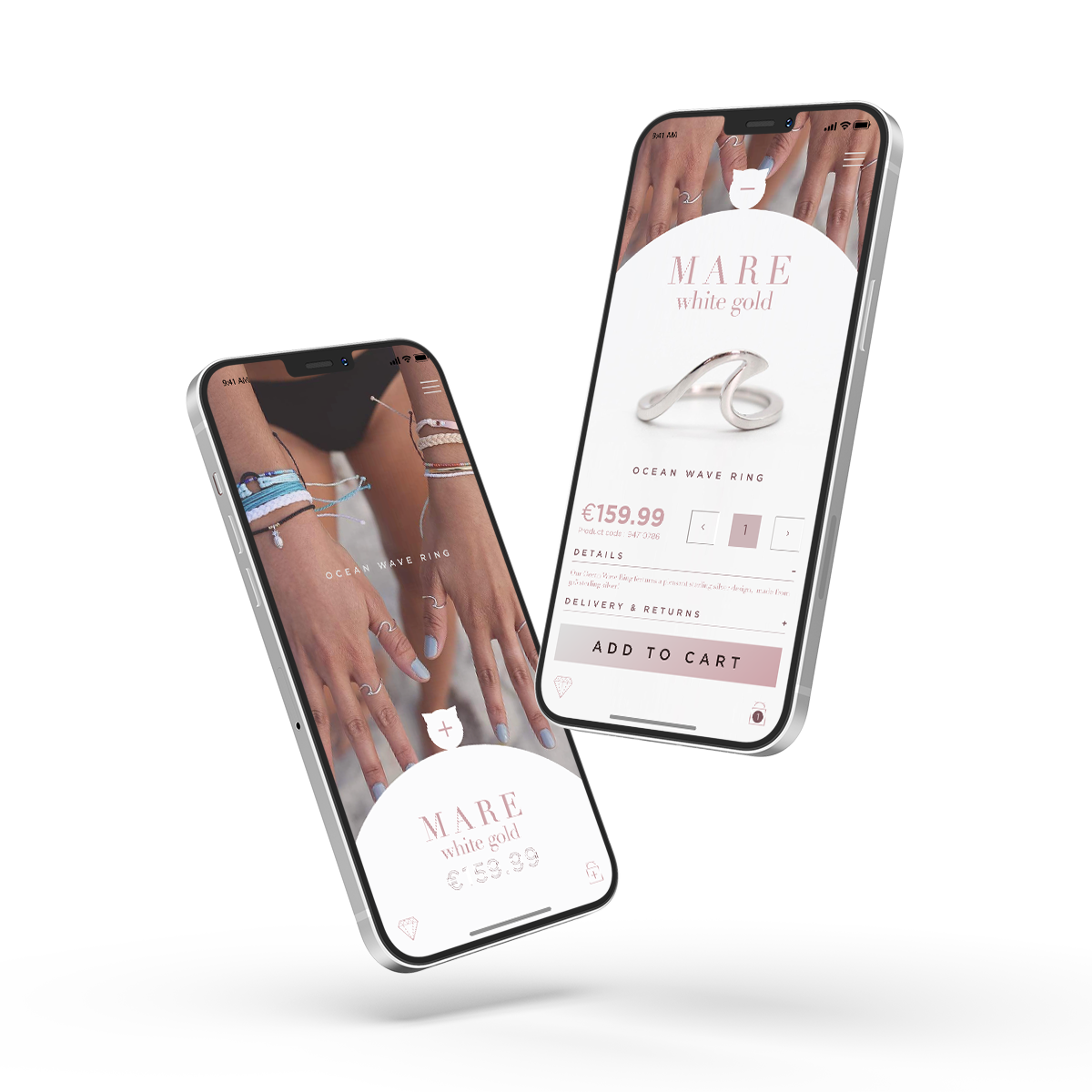
The resulting imagery shaped not only the campaign visuals but also the website’s mood, influencing UI textures, hover animations, and product interactions that mimicked the feeling of touching a piece of handmade metal.
The Business Model Canvas
We outlined the brand’s business structure, defining its digital opportunities, target clientele, and partnerships that would strengthen both in-person and online experiences.
We conducted interviews with both loyal customers and new visitors to understand how people connected with jewellery emotionally — why they bought, how they wore it, and what stories they attached to each piece.
The journey mapped both in-store and online touchpoints, emphasizing consistency between the tactile experience of the product and the fluid navigation of the website.
We simplified the digital flow to focus on emotion over transaction, ensuring each interaction reinforced the feeling of intimacy and exclusivity.
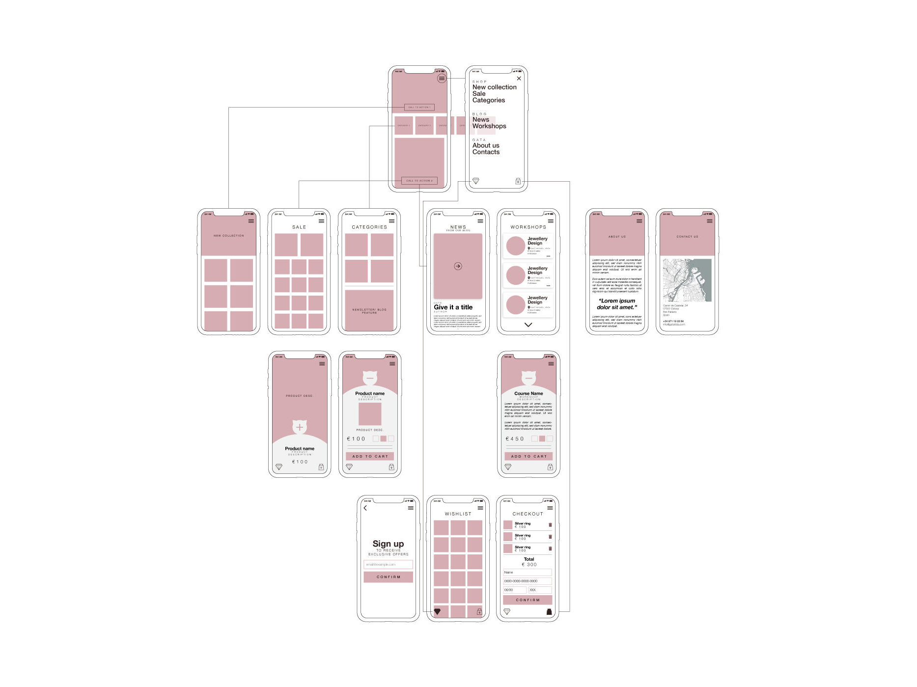
Wireframes and Usability Testing
Wireframes translated emotional insights into structure, allowing us to experiment with how light, space, and rhythm could guide users through the site.
Testing revealed the need for micro-interactions that mimicked the sensory pleasure of trying on jewellery — subtle animations, soft transitions, and an immersive zoom-in product view.
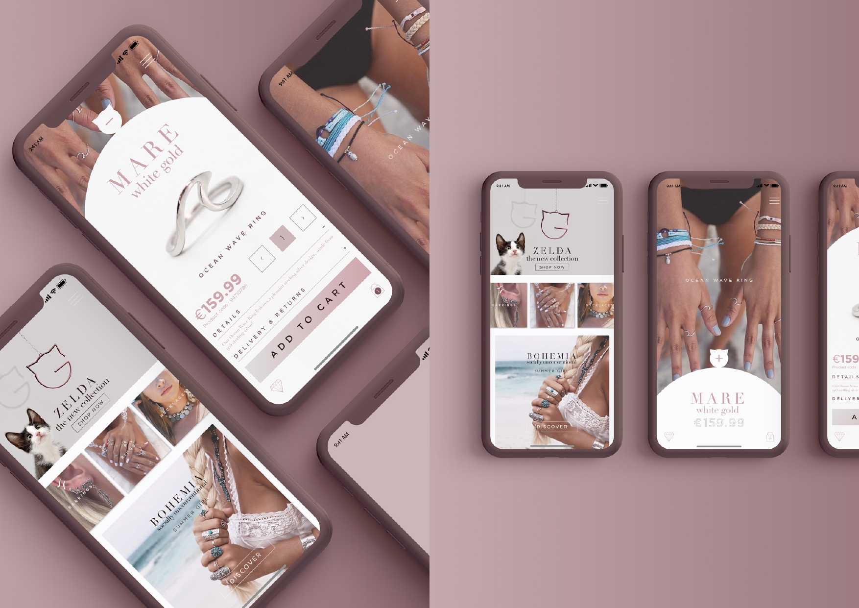
Design Solutions
Behavioral data showed where users lingered and where attention faded, leading to adjustments that made the browsing experience more fluid and visually engaging.
Refined to prioritize storytelling first, checkout second — a deliberate inversion that reflected the brand’s philosophy: connection before conversion.
Final design integrated a fluid layout with high-impact visuals, responsive storytelling, and an intuitive shopping experience. Each product felt like an encounter rather than an item.
The final prototype married motion, texture, and light — transforming digital space into something tactile, emotional, and true to the brand’s spirit.